Button
1. Create a button widget
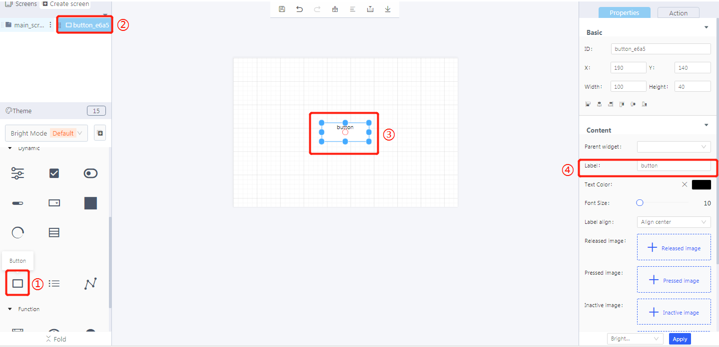
① Create a button
② Button ID
③ The created button
④ Add text to the button
2. Widget properties
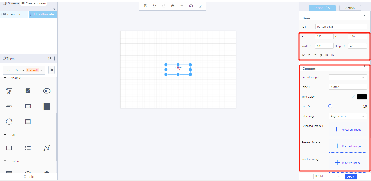
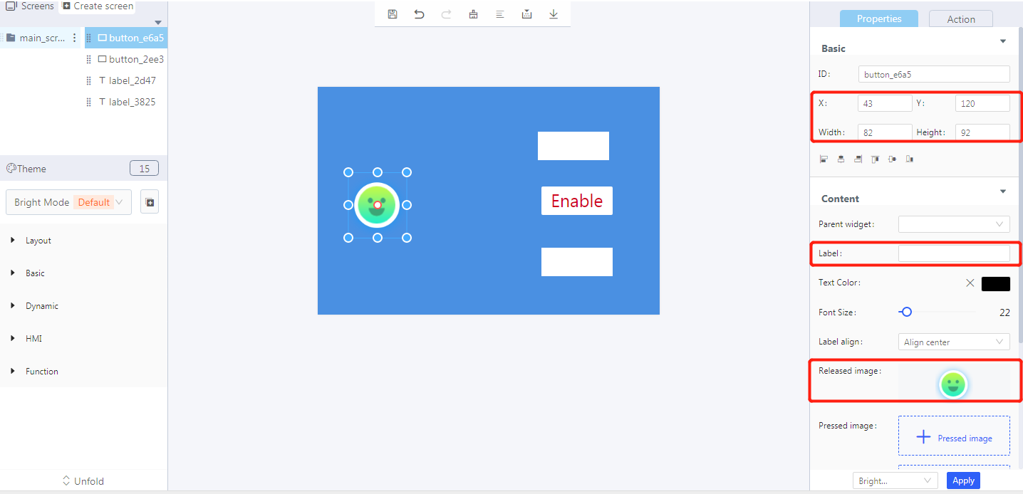
Properties-Basic:
ID: button_e6a5 is the unique ID number of the button widget
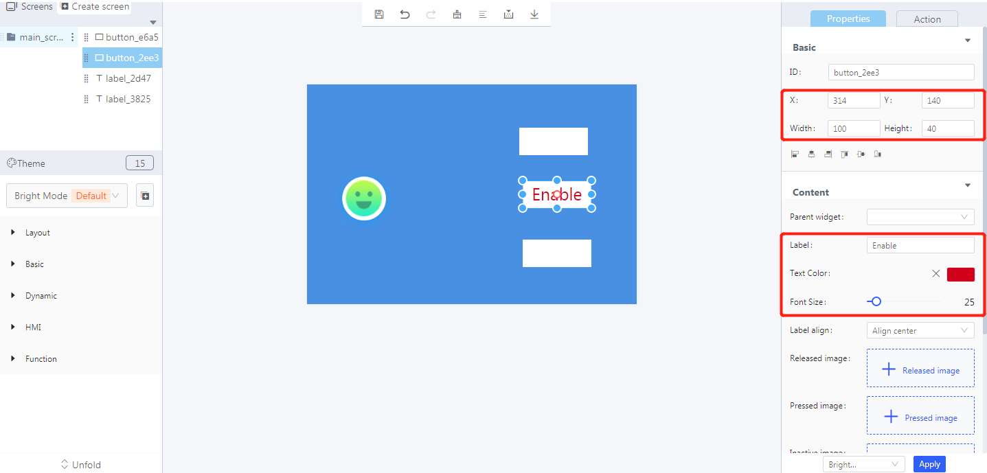
X, Y: the position of the button widget in the display area; the upper left corner is the starting point; it can also be set by drag and drop.
Width, Height: the size of the button widget; it can also be set by drag and drop.
Alignment (in order): left alignment, horizontal center alignment, right alignment, top alignment, vertical center alignment, bottom alignment
Properties-Content:
Parent widget: set the parent object, and the button widget is its child object
Label: input text displayed in the button widget
Text color: the color of the input text in the button widget
Font size: the font size of the input text in the button widget
Label align: align center, align left, align right
Released image: the image displayed on the button widget without operation when it is enabled
Pressed image: the image displayed on the button widget when it is pressed
Inactive image: the image displayed on the button widget when it is disabled
Checked image: the image displayed on the button widget when its is checked
Note: a label button and an image button cannot appear at the same time.
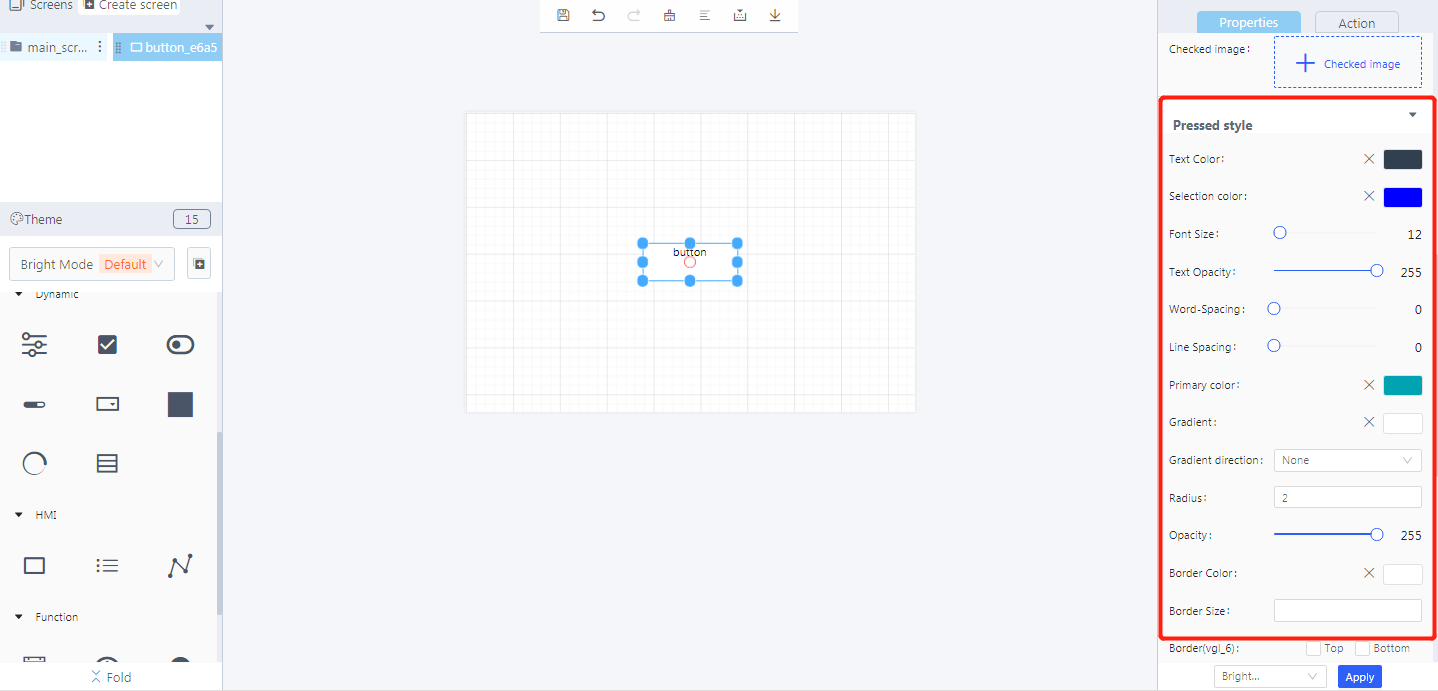

Properties-style:
- Text color: the text color of the button widget when the button is operated
- Selection color: the text color when the button is operated
- Font size: the font size when the button is operated
- Text opacity: the opacity level of the text when the button is operated
- Word spacing: the spacing between two words when the button is operated
- Line spacing: the spacing between two lines when the button is operated
- Primary color: the background color of the button when the button is operated
- Gradient color: the color that the primary color slowly changes into
- Gradient direction: horizontal, vertical
- Radius: the corner radius of the button widget border
- Opacity: the opacity level of the button widget
- Border color: the border color of the button widget
- Border size: the proportion of the border in the button widget
- Border (vgl_6 and vgl_7): the position and type of button border (vgl_6 or vgl_7)
- Border opacity: the opacity level of button border
- Shadow color: the display color of the shadow when setting the shadow
- Shadow width: the display size of the shadow when setting the shadow
- Shadow: shadow position, bottom or full
- Top, bottom, left, and right padding: the distance between its content and its border (four directions: top, bottom, left, and right)
Note: the settings of the released style and the inactive style are basically the same as the that of the pressed style.
3. Blockly—Button
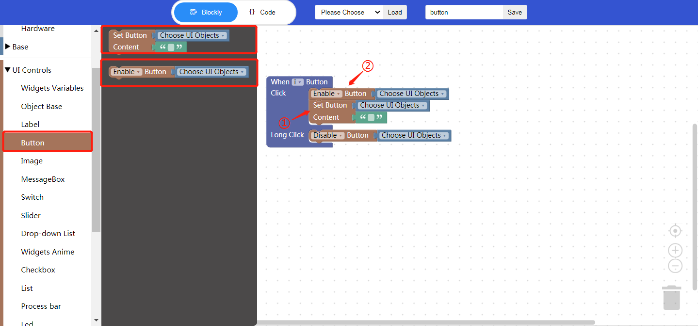
① Set button content (used with Process/Event)
Choose UI objects: choose a button ID created in Layout-Designer
Content: click to enter text, that is, the text content displayed on the button widget
② Enable button (used with Process/Event)
Choose UI objects: choose a button ID created in Layout-Designer
Enable: choose to enable or disable the button widget
Example: bind the button ID, enable the button widget, and set the button content as “Clicked”; long press to disable the button widget.
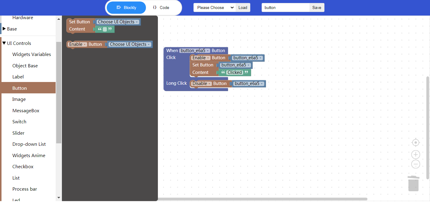
- Click “{} code” to view the code:

① Button event, short click or long press
② Set button content
4. Implement a button example with Blockly
Click and long press a button to change the state of another button and the content of other labels
- UI design
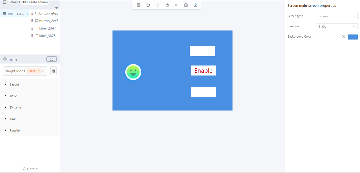
- Create button widgets
- Create label widgets
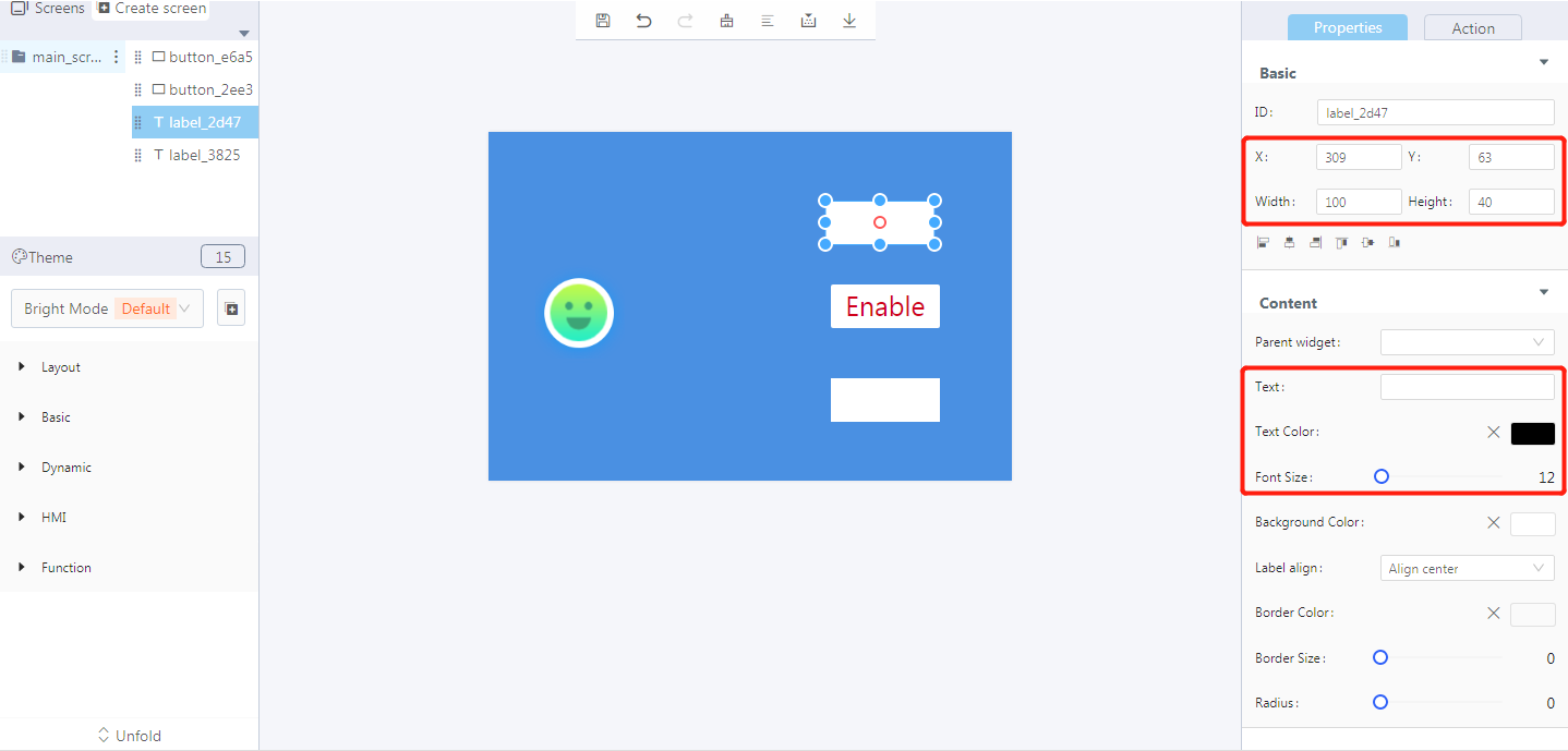
- Blockly design
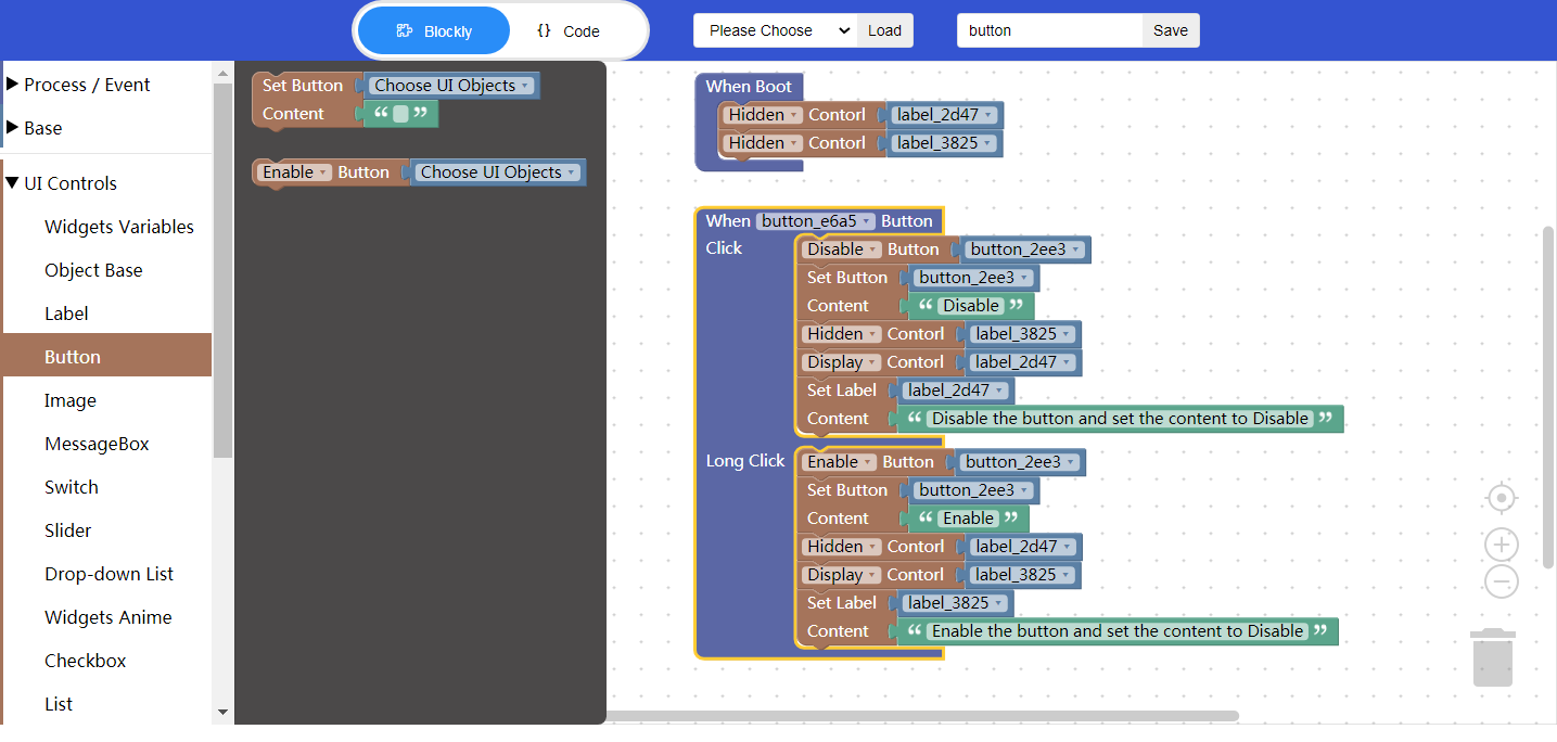
5. Download and analyze the source code of the project
5.1 Zip files

① Font
② Image
③ Main function
5.2 qm_ui_entry.c analysis
- Entry function
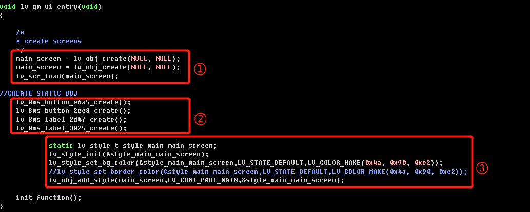
① Create objects
② Create widgets
③ Set the styles
- Relevant variable declaration
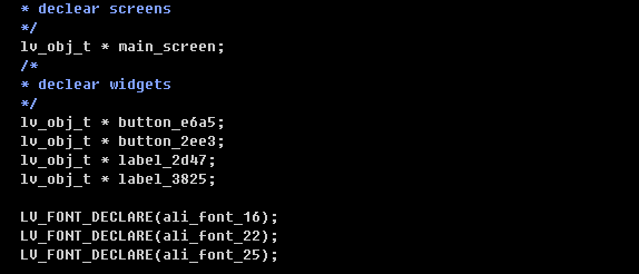
- Blockly logic implementation
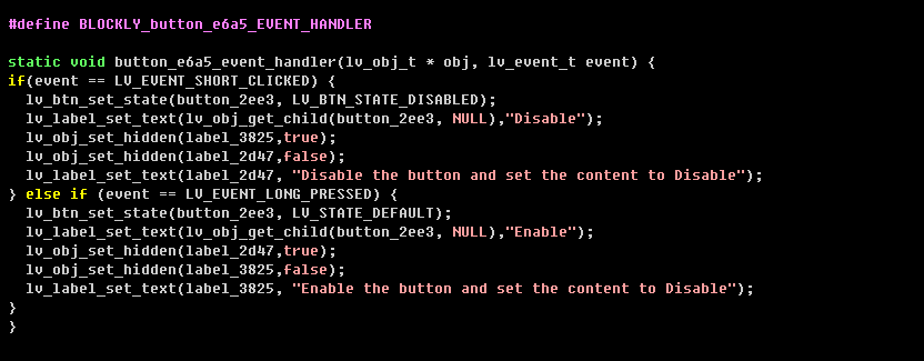
- Create buttons and set the styles
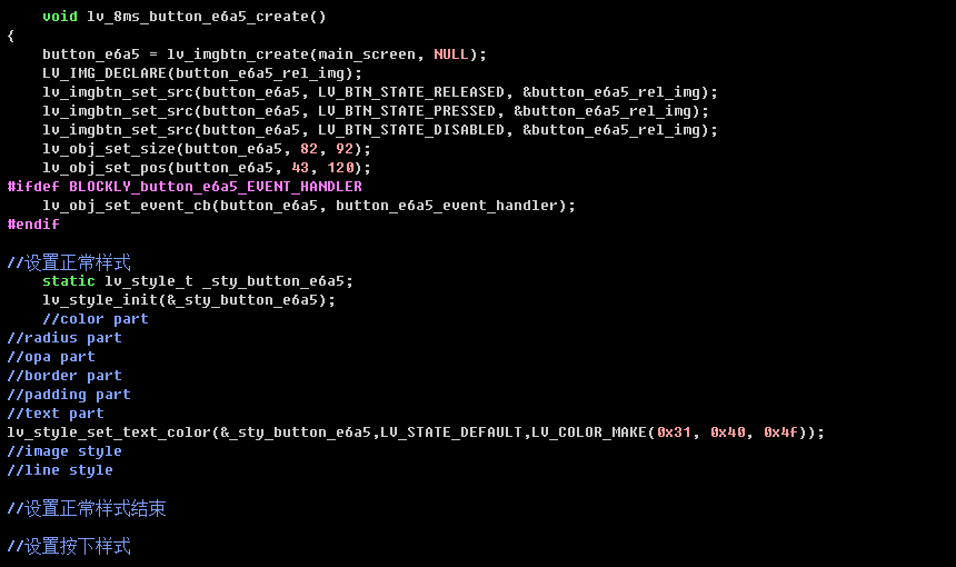
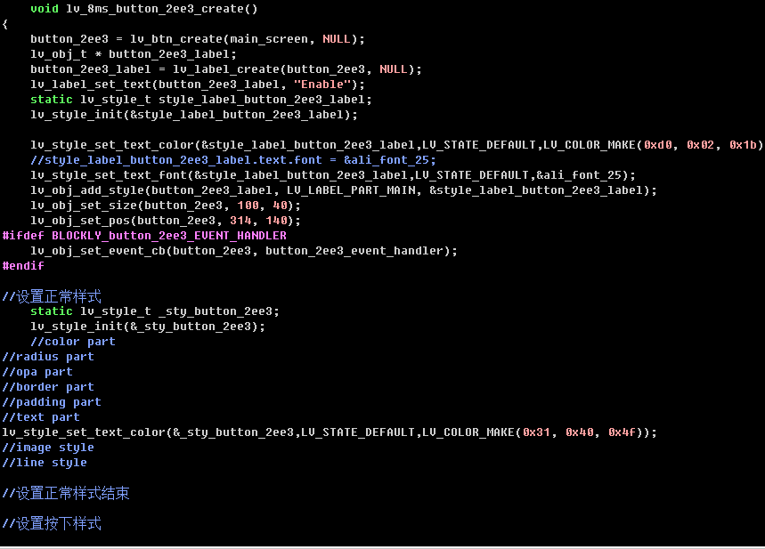
- Create labels and set the styles
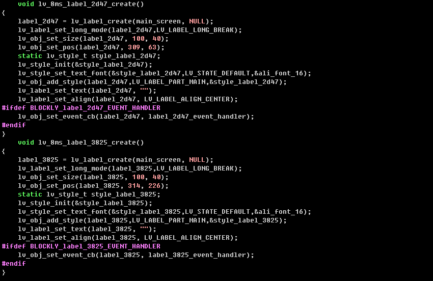
6. Demo


