Roller
1. Create a roller widget
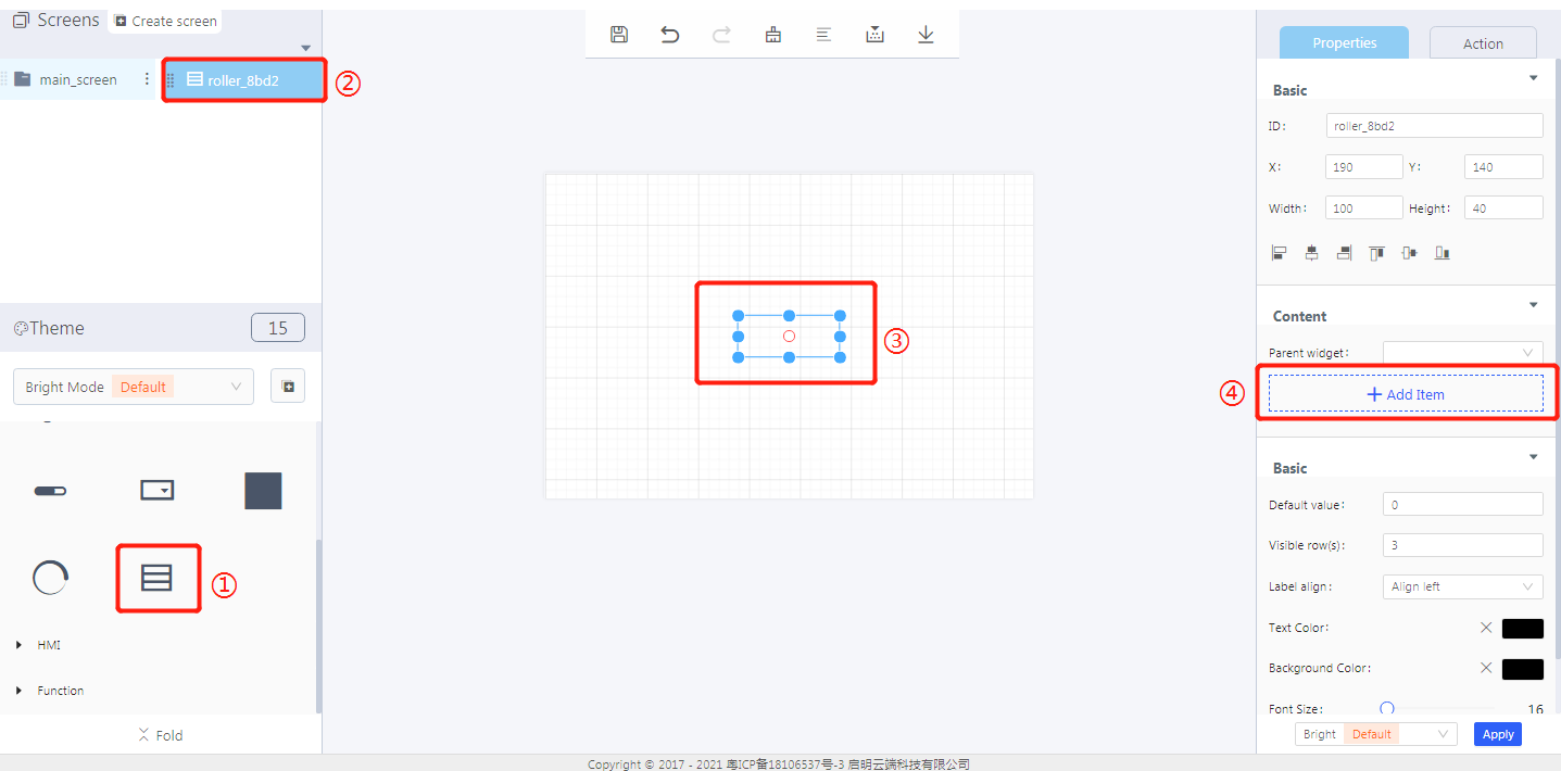
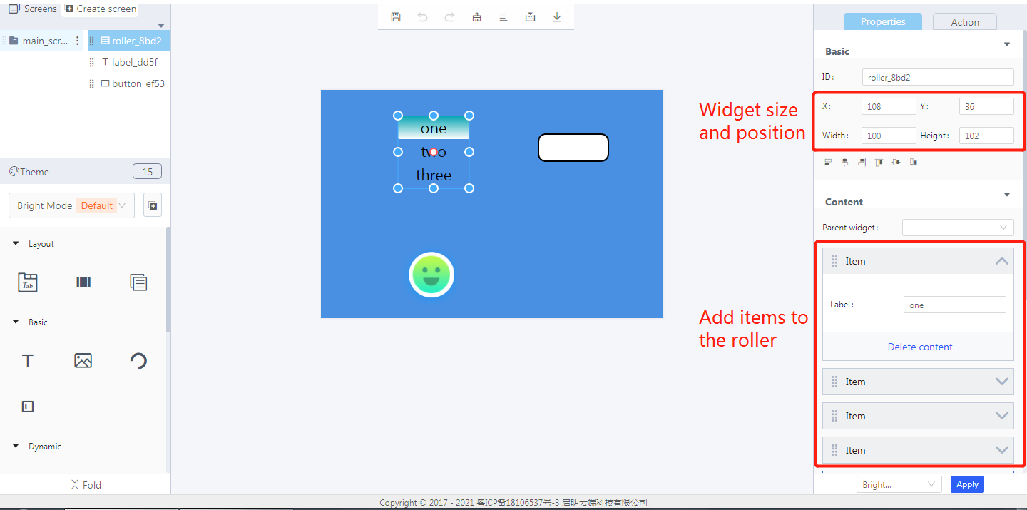
① Create a roller widget
② The roller widget ID
③ The created roller widget
④ Add items
2. Widget properties
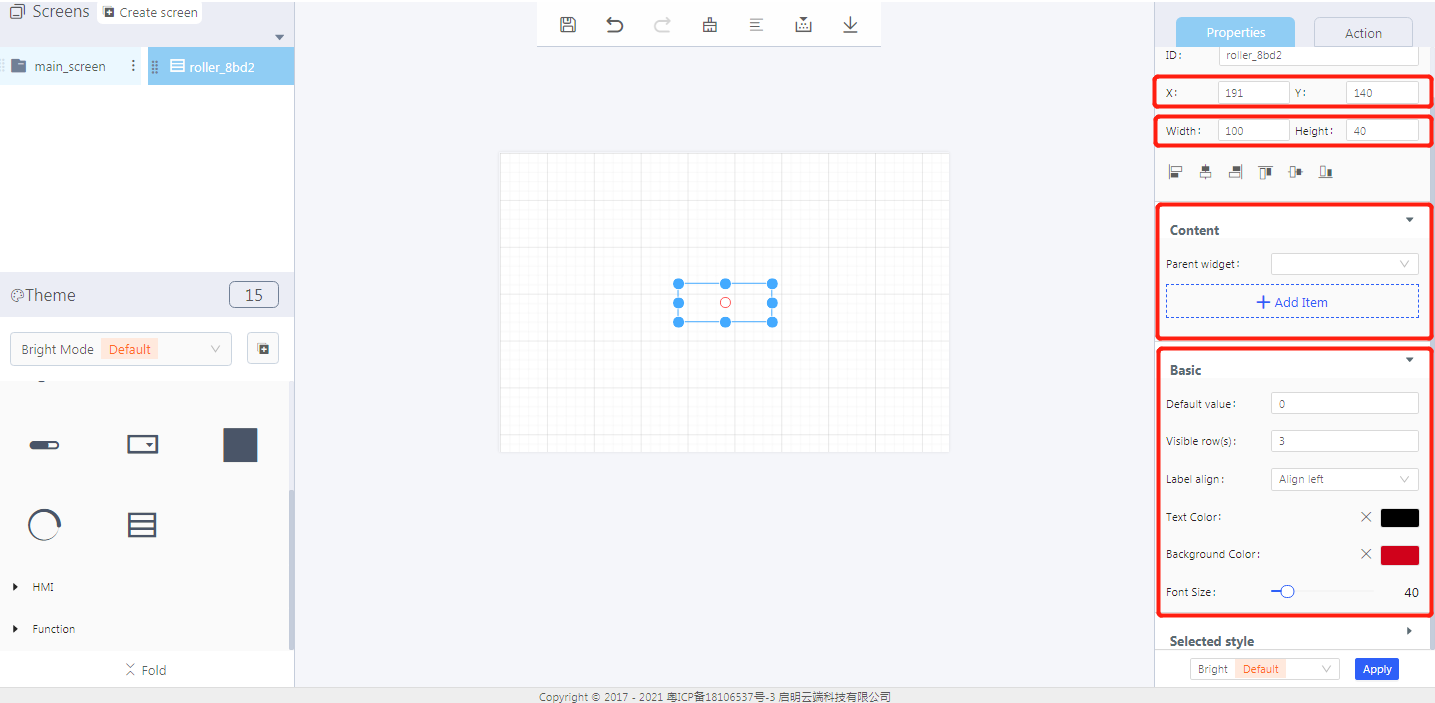
Properties-Basic:
ID: roller_8bd2 is the unique ID number of the roller widget
X, Y: its coordinate position in the display area
Width, Height: the size of the roller widget
Alignment (in order):Left alignment, horizontal center alignment, right alignment, top alignment, vertical center alignment, bottom alignment
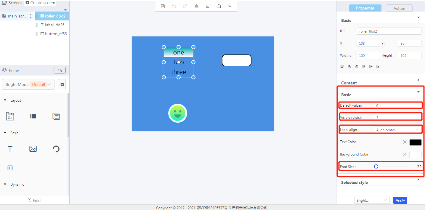
Default value: the initial number of rows in a roller
Visible row(s): the number of rows that can be displayed
Label align: align left, align center, align right
Text color: the color of the added text in the display area
Background color: the background color of a roller widget
Font size: the font size of the added text in the display area
Properties-Content:
Parent widget: set the parent object, and the roller widget is its child object
Add item: add content to a roller widget
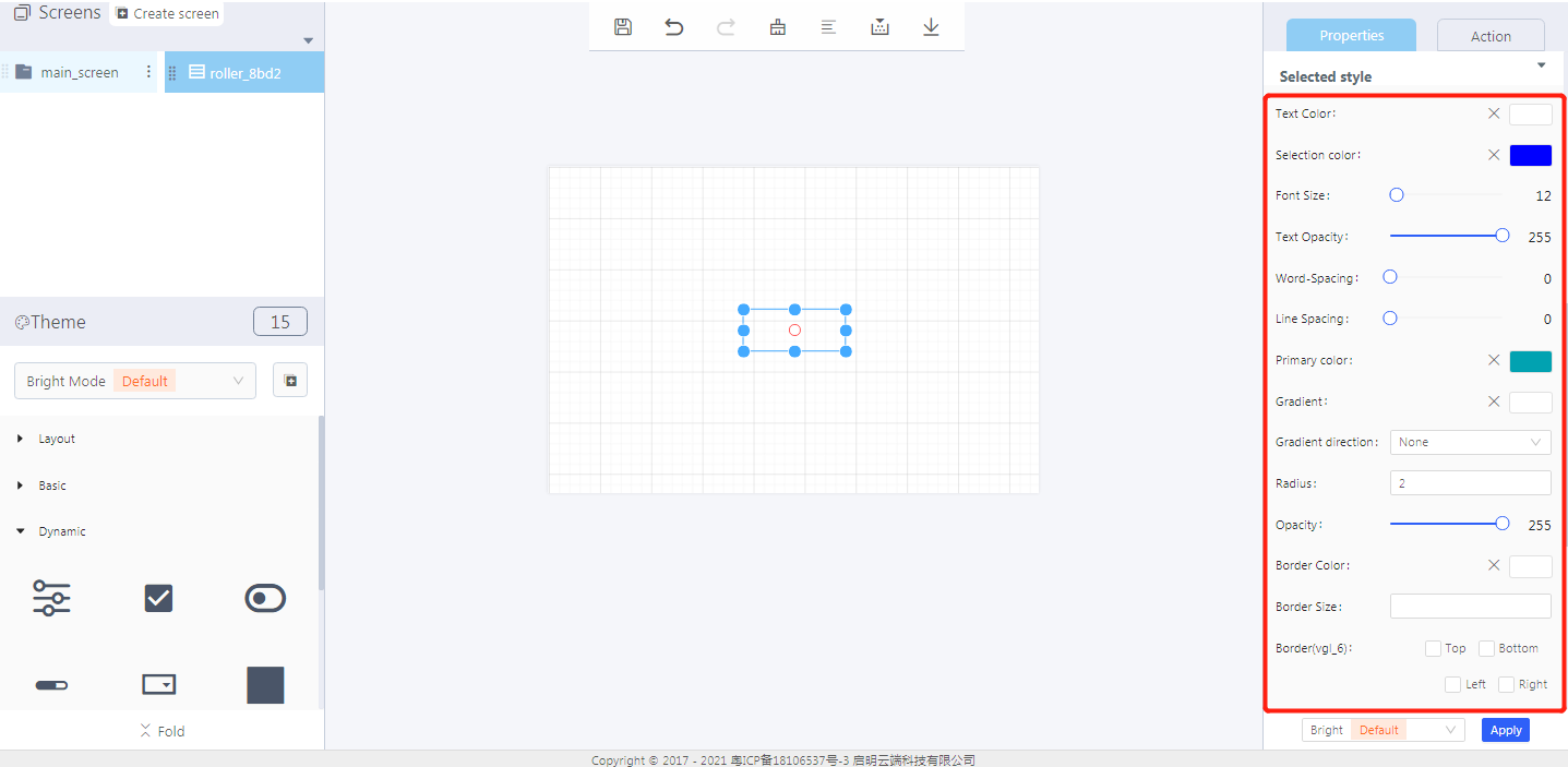
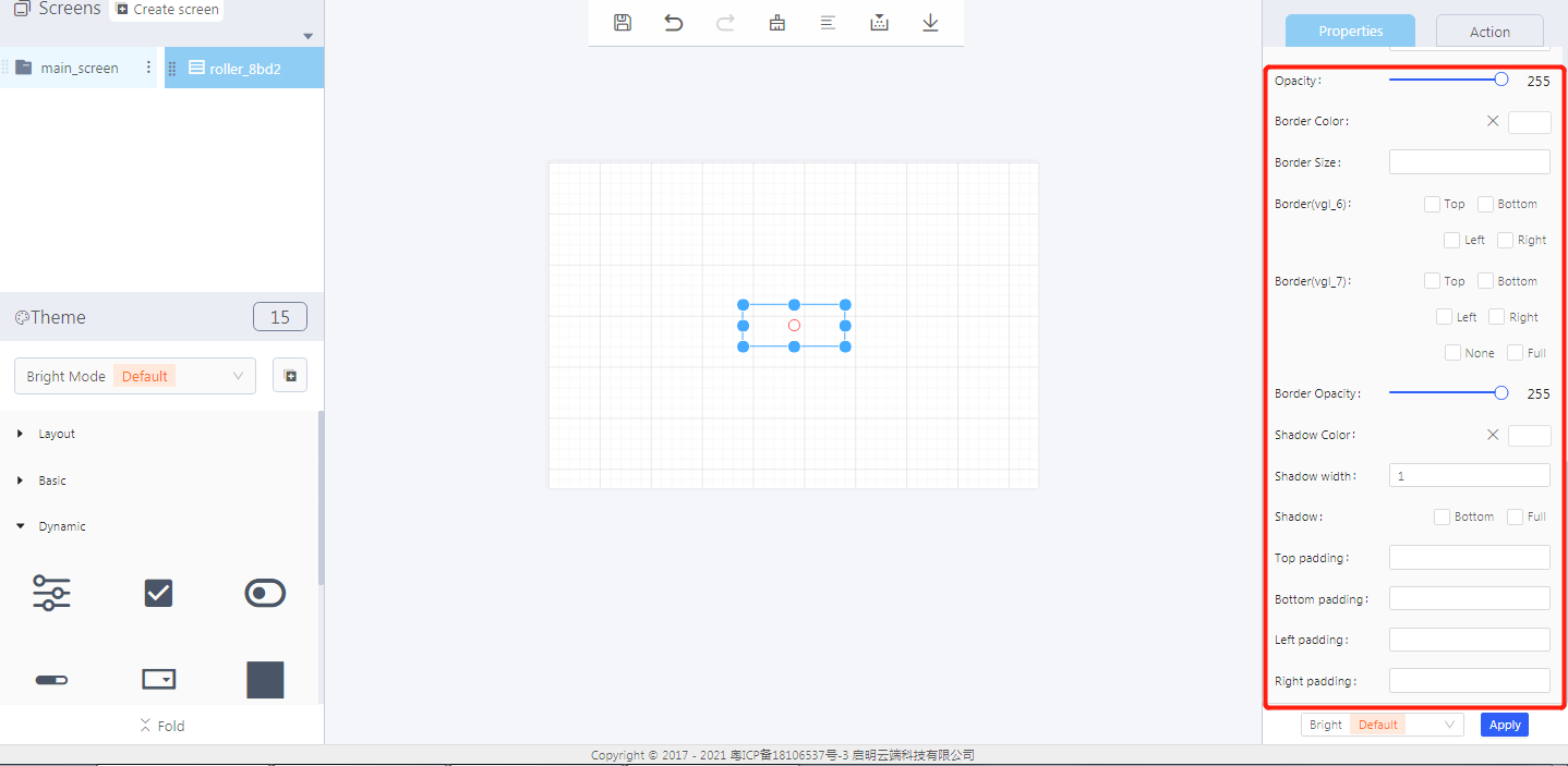
Properties-Selected style:
- Text color: the text color when the roller is selected
- Selection color: the background color when the roller is selected
- Font size: the font size of the selected roller item
- Word spacing: the space between two characters when the roller is selected
- Line spacing: the space between two rows when the roller is selected
- Primary color: the main background color of the roller area when the roller is selected
- Gradient: the color that the primary color slowly changes into
- Gradient direction: horizontal or vertical
- Radius: the border radius of a roller widget
- Opacity:the transparency level of the roller widget
- Border color: the display color of the border when it is set
- Border size: the percentage of the border in the roller area
- Border(vgl_6 and vgl_7): the position and type of the roller border (vgl_6 or vgl_7)
- Border opacity: the transparency level of the border color
- Shadow color: shadow color to display
- Shadow width: shadow width to display
- Shadow: shadow position, bottom or full
- Top/Bottom/Left/Right padding: the distance between the content box and the border box in the four directions respectively
3. Blockly—Roller

① Read roller value (need to be used with Process/Event)
- Select UI controls: the roller widget ID in Layout-Designer
*Note: the roller value to be read is the roller item ID (starting from 0) *
② Scroll roller direction (down)
- Down or up is optional
- Select UI controls: the roller widget ID in Layout-Designer
Example: bind the roller widget ID: roller_ 8bd2, long press the button to scroll the roller down.
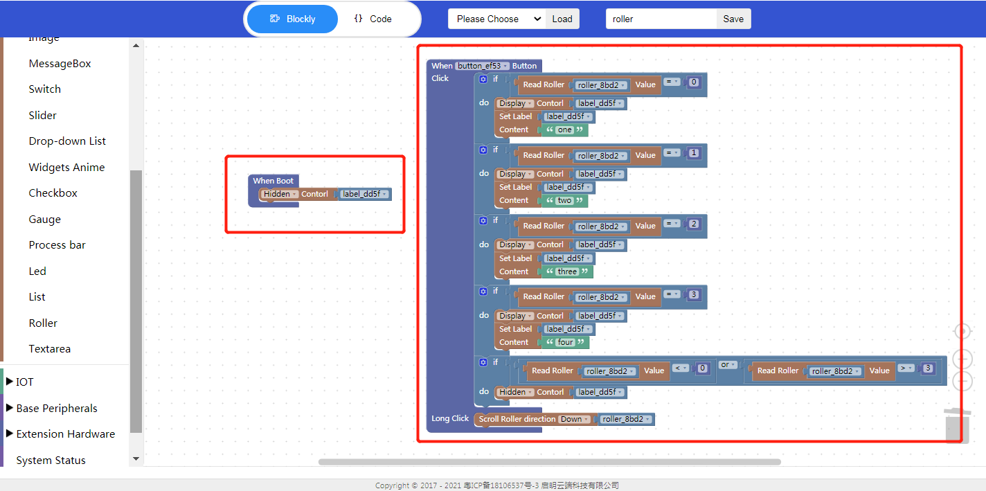
- Click “{} code” to view the code:
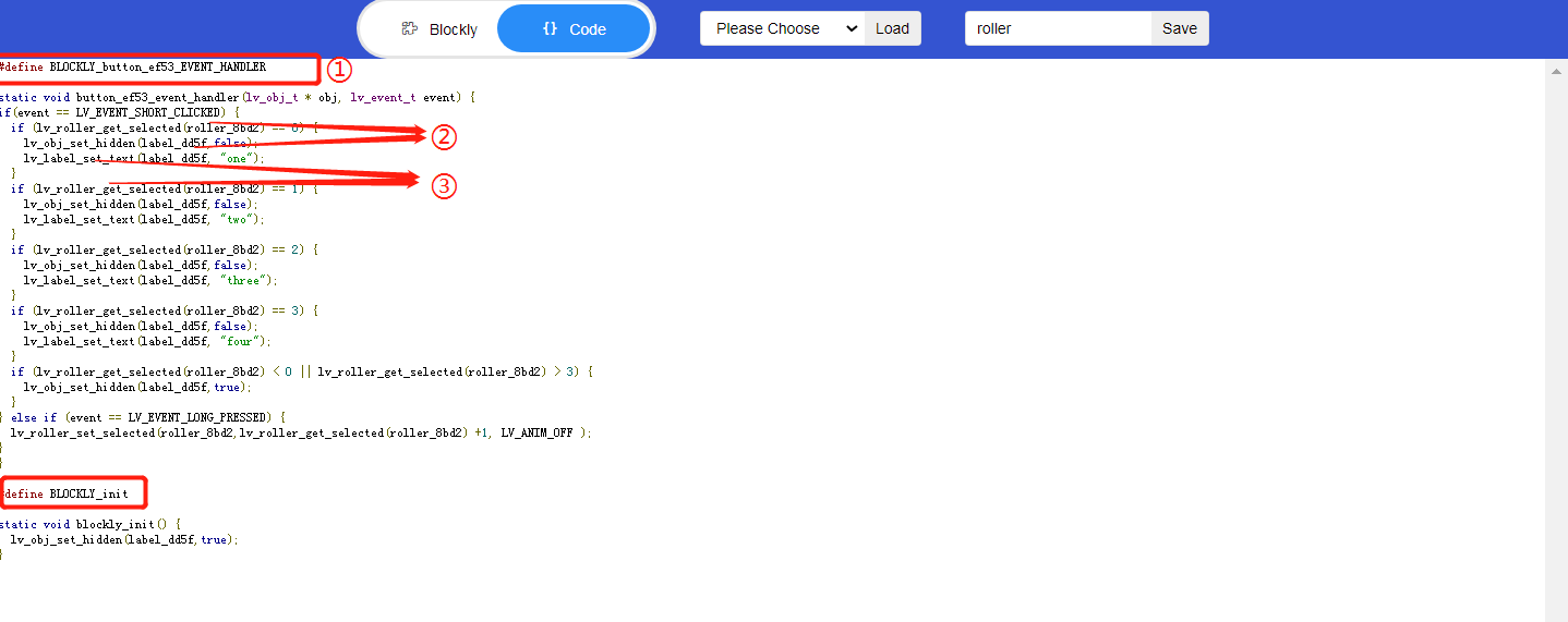
① Enable the following function
② Widget ID
③ API
4. Implement an example in Blockly
Click the button to read the text of the selected roller item, and long press to scroll the roller implemented in Blockly.
- UI design

- Create a roller widget
- Create a button widget
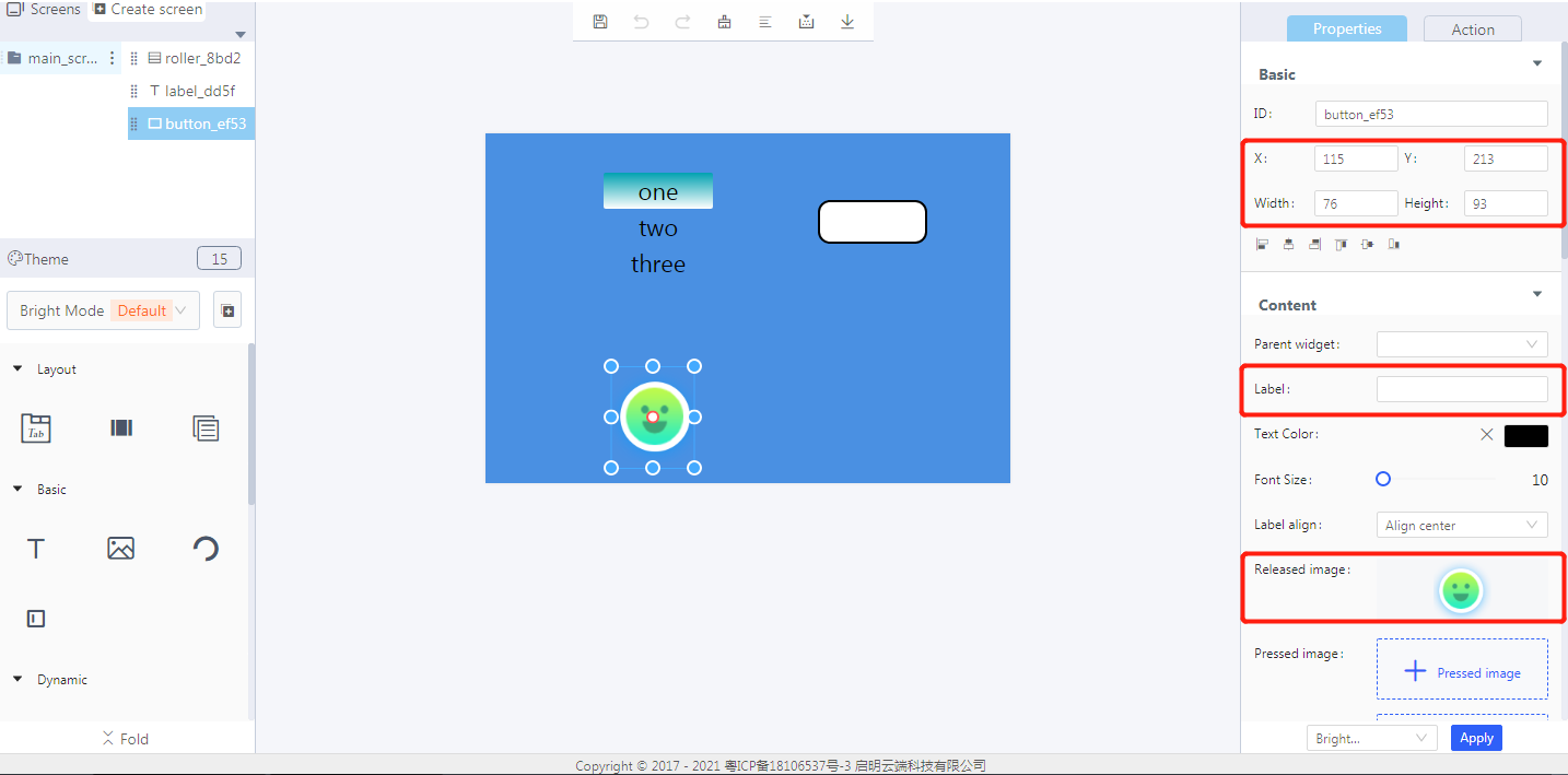
- Create a label widget
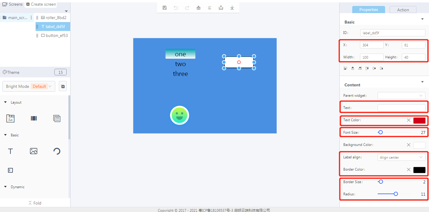
- Blockly design
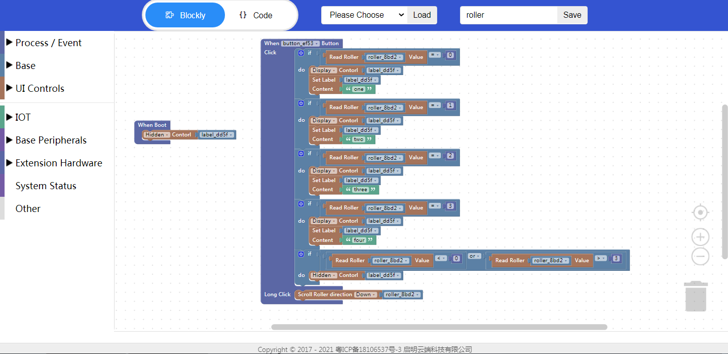
5. Download and analyze the source code of the project
5.1 Zip files

① Font
② Image
5.2 qm_ui_entry.c analysis
- Entry function

① Create objects
② Create widgets
③ Style
- Relevant variable declaration

- Blockly logic implementation

- Create a roller and set its style
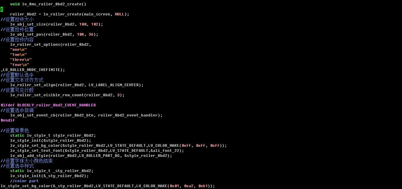
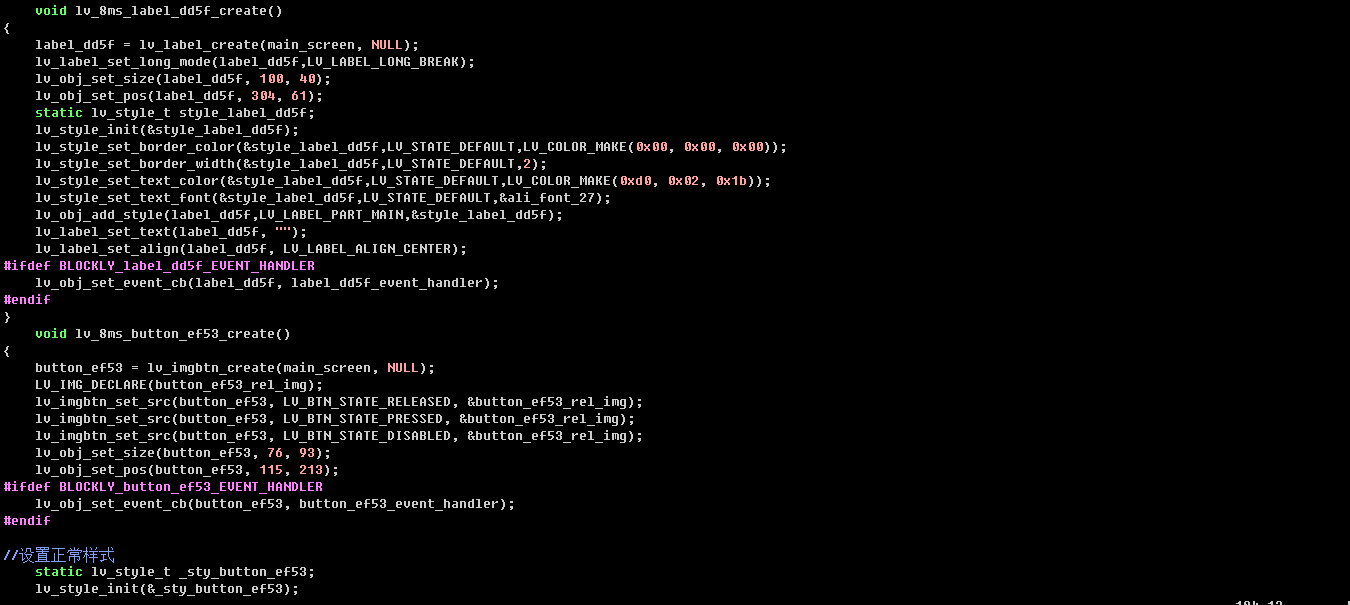
- Create a label and a button and set their styles
6. Demonstration
- Initial state

- Click the button

- Long press the button

