Switch
1. Create a switch widget
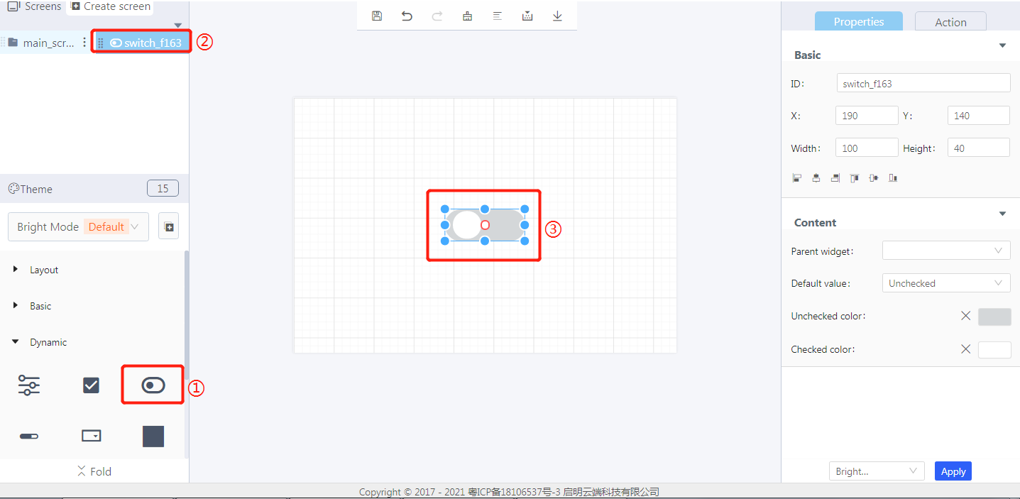
① Create a switch
② The switch widget ID
③ Drag and drop to manually adjust the switch size
2. Steps for use
2.1 Set the switch style
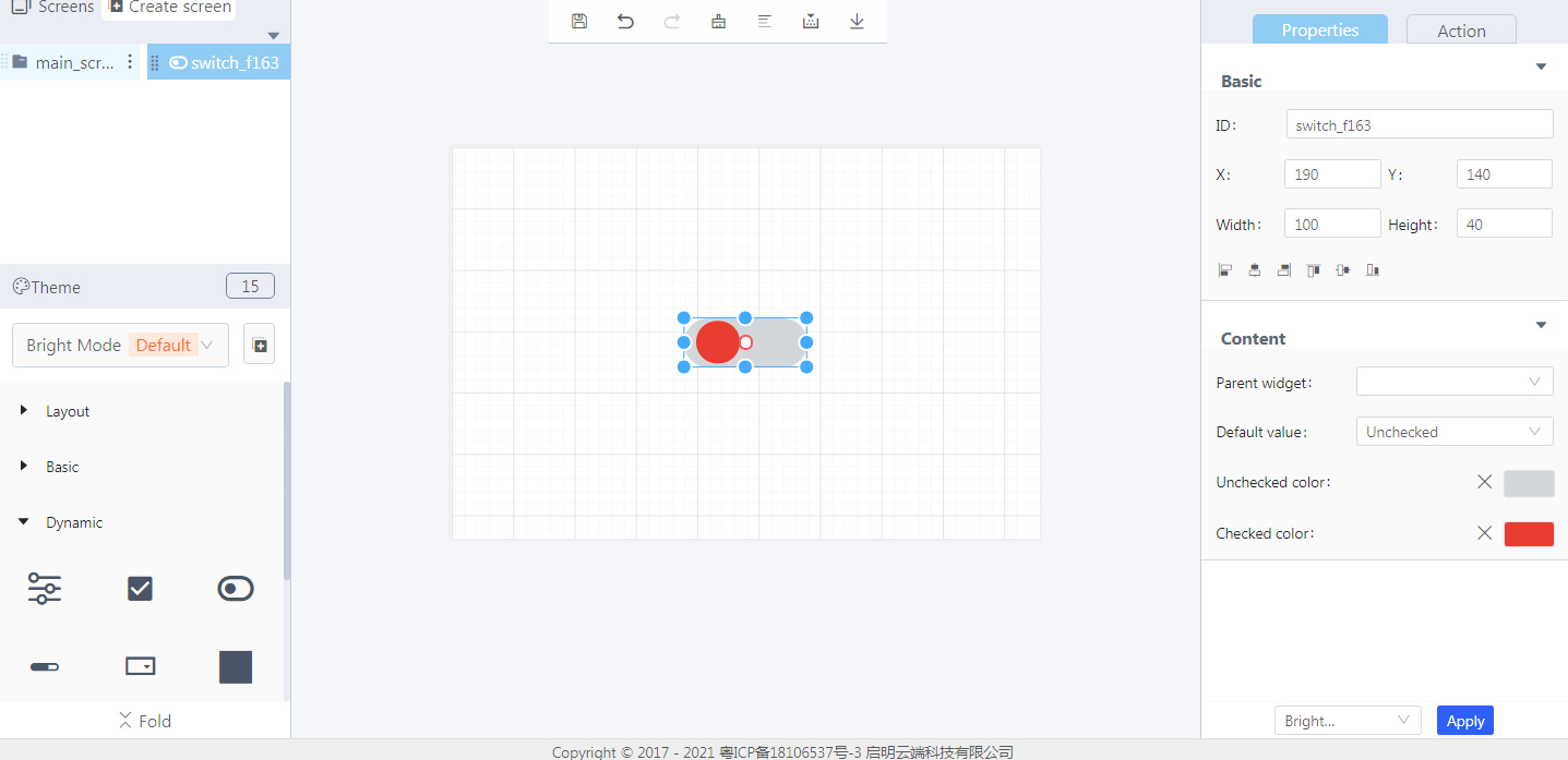
Properties-Basic:
ID: switch_f163 is the unique ID number of the switch widget
X, Y: its coordinate position in the display area
Width, Height: set the size of the widget
Alignment (in order): left alignment, horizontal center alignment, right alignment, top alignment, vertical center alignment, bottom alignment
Properties-Content:
Parent widget: set the parent object, and the switch widget is its child object
Default value: set the initial state of the switch as unchecked/checked
Unchecked color: the color display when the switch is not checked
Checked color: the color display when the switch is checked
3. Blockly—Switch
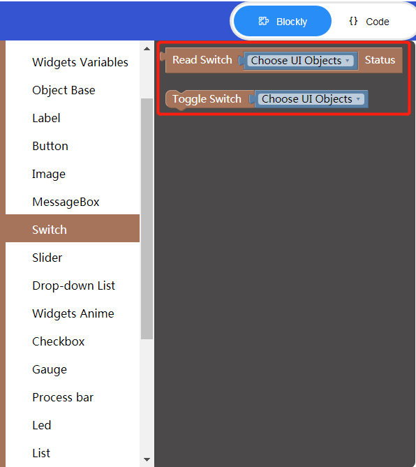
Blockly description
① Read switch status
- Choose UI objects: the switch widget ID in Layout-Designer
- Read returned value: false: off; true: on
② Toggle switch status (need to be used with Process/Event)
- Choose UI objects: the switch widget ID in Layout-Designer
- Toggle the current switch status
4. Implement an example in Blockly (esp32)
- UI design
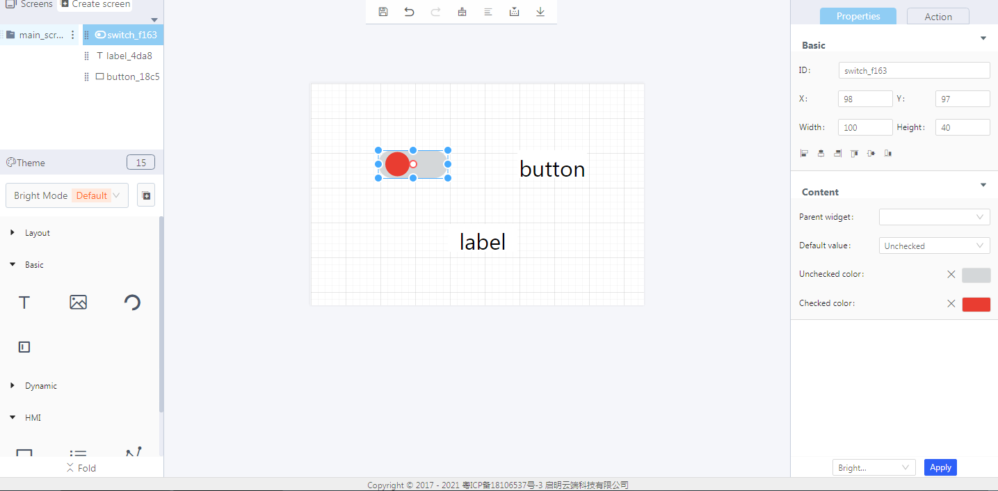
- Blockly design
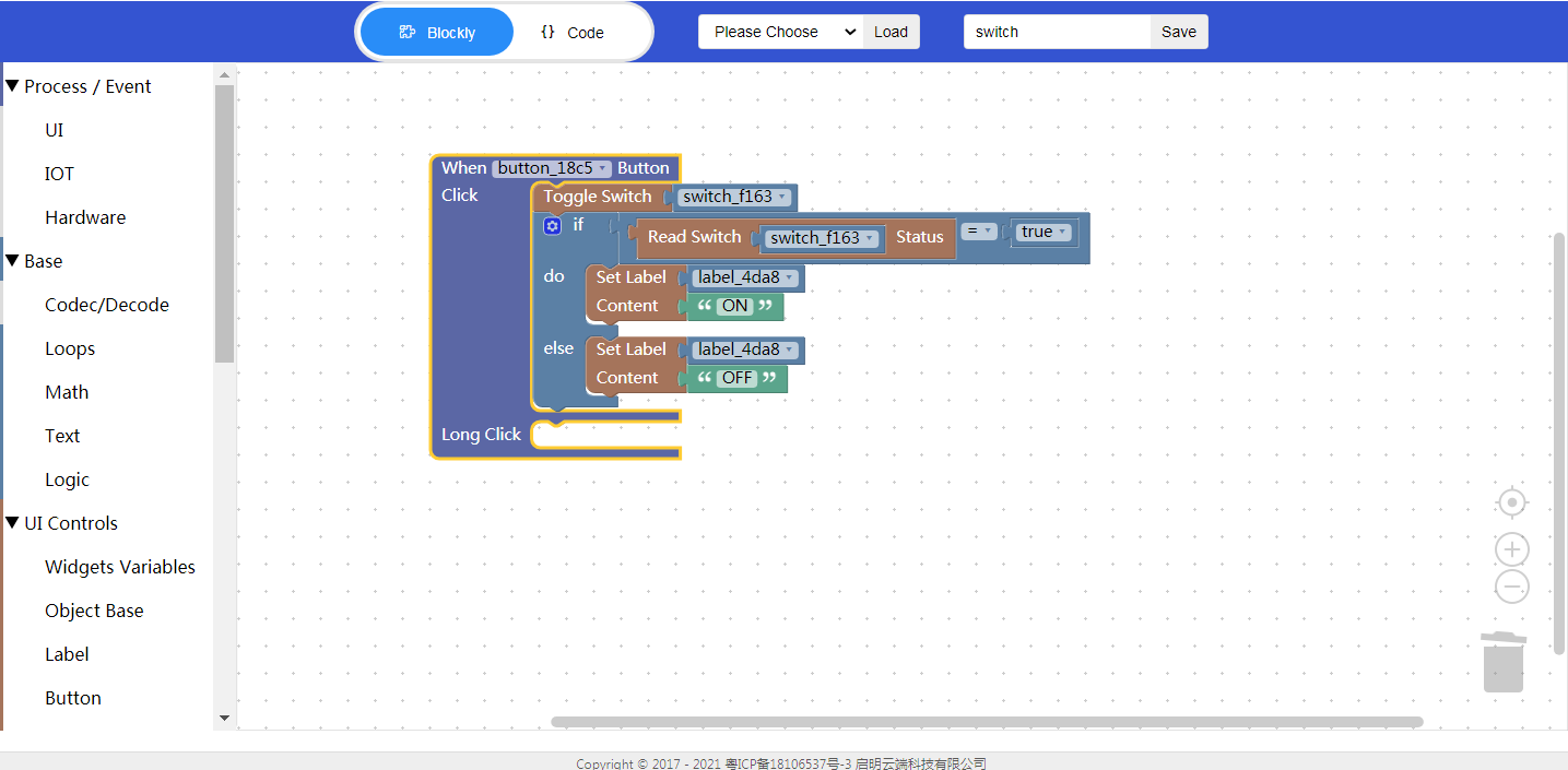
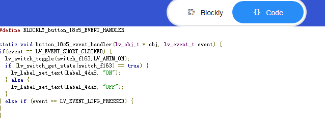
Example description: Click the button to toggle the switch status. When the switch status is true (ie, switched on), the label content is displayed as “ON”. Otherwise, the label content is displayed as “OFF”.
- Click “{} code” to view the code:
5. Download and analyze the source code of the project
① Variable declaration

② Create a switch and set its style
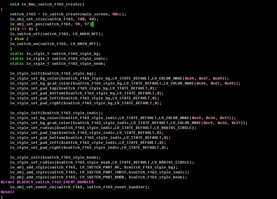
③ Code generated from Blockly

