Slider
1. Create a slider widget
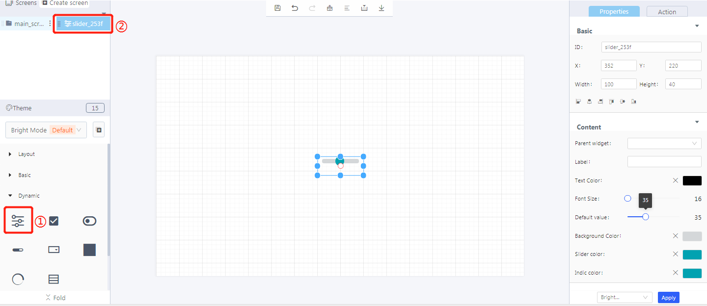
① Create a slider
② Slider ID
2. Steps for use
2.1 Widget properties
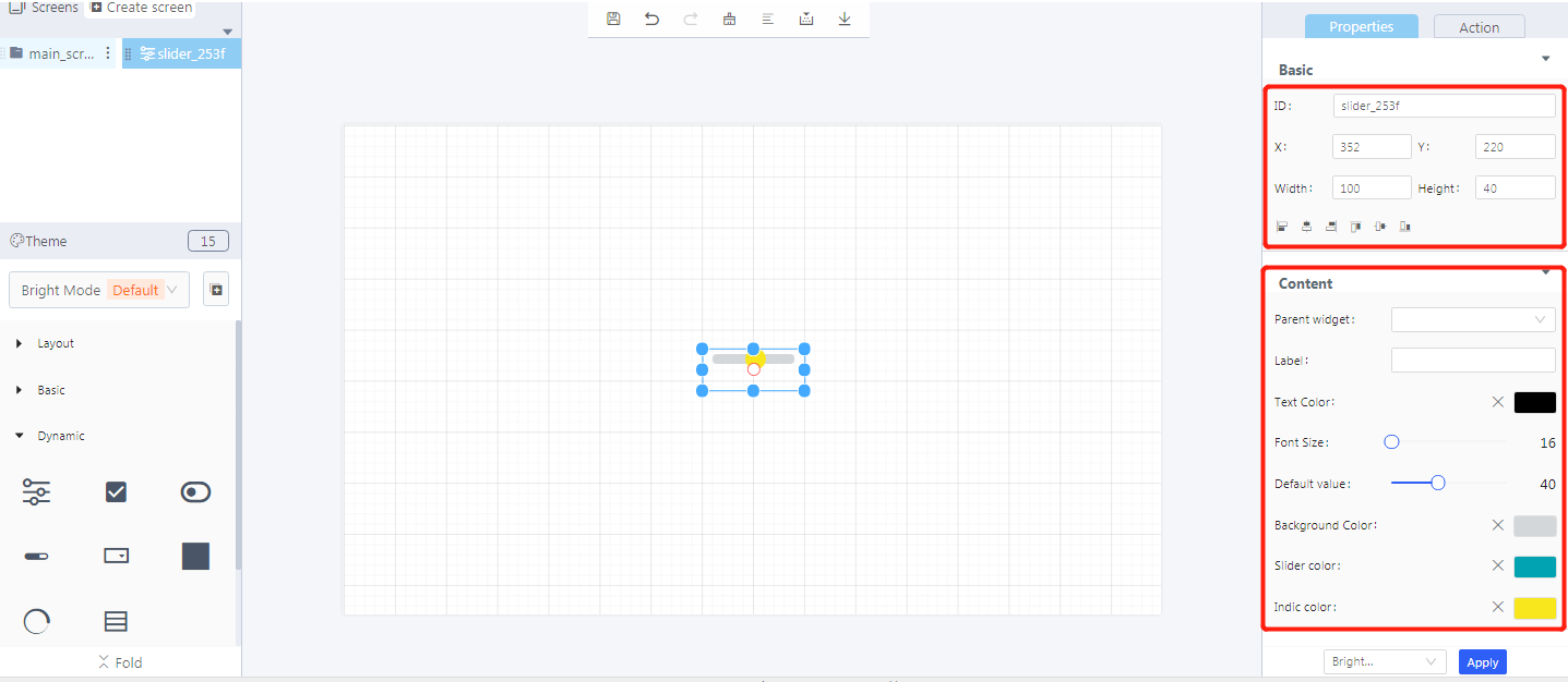
Properties-Basic:
ID: slider_253f is the unique ID number of the slider widget
X, Y: its coordinate position in the display area
Width, Height: set the size of the slider widget
Alignment (in order): left alignment, horizontal center alignment, right alignment, top alignment, vertical center alignment, bottom alignment
Properties-Content:
Parent widget: set the parent object, and the slider widget is its child object
Default value: the initial value of a slider widget
Background color: the color of the unslided area
Slider color: the color of the slided area
Indic color: the indicator color of a slider widget
3. Blockly—Slider
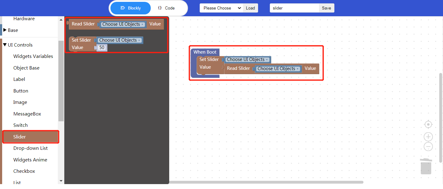
3.1 Set slider value(used with Process/Event)
Choose UI objects: the slider widget ID in Layout-Designer
Value: click to input a value, or insert a Blockly to read the widget value, which is equivalent to setting the default value of the slider.
3.2 Read slider value
- Choose UI objects: the slider widget ID in Layout-Designer
- Value: get the current position value of the slider (default range: 0-100), and the returned value is a numeric value, which cannot be sent directly as a text. Type conversion is required.
Example: bind the slider widget id: slider_253f, set the read slider value.
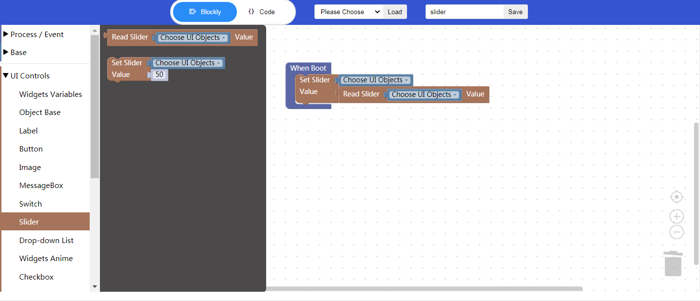
Click “{} code” to view the code:

① Enable Blockly function
② Set the slider value
③ The slider widget ID
④ Get the slider value
⑤ Turn off sliding animation
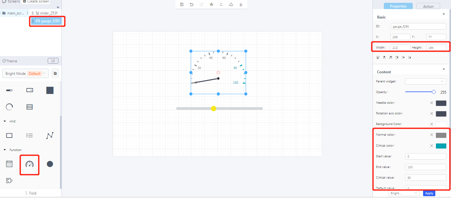
4. Implement controlling a gauge with a slider in Blockly (ssd201)
- UI design
- Blockly design
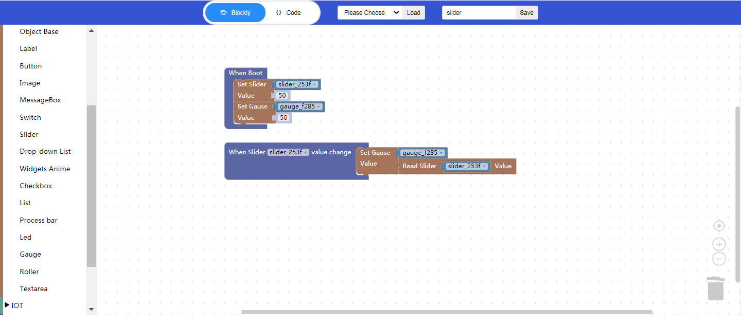
5. Download and analyze the source code of the project
- Zip files

① Font
② Task and widget entry
- qm_ui_entry.c analysis
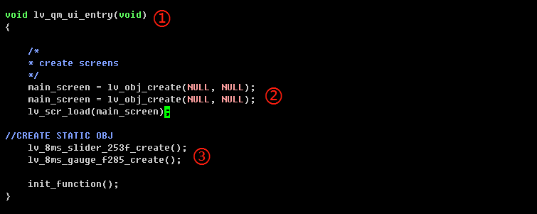
① Function entry
② Create objects
③ Widget init API

④ Relevant variable declaration
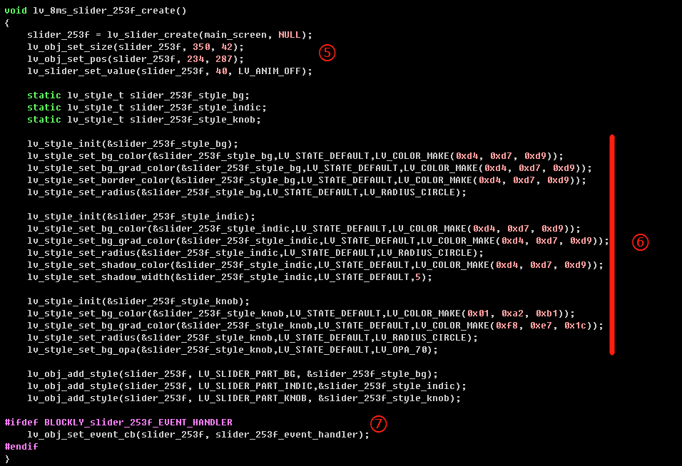
⑤ Create a slider widget
⑥ Style init
⑦ Create a slider event—callback function
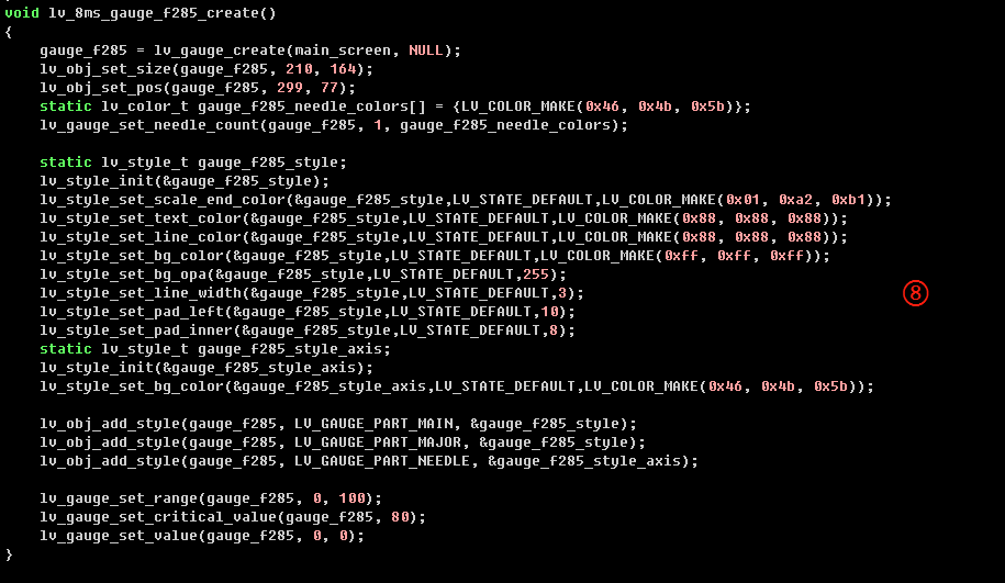
⑧ Create a gauge widget and init its style
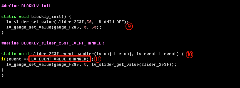
⑨ Blockly logic implementation
⑩ Callback function entry of the slider event
⑪ Event name
