Bar
1. Create a bar widget
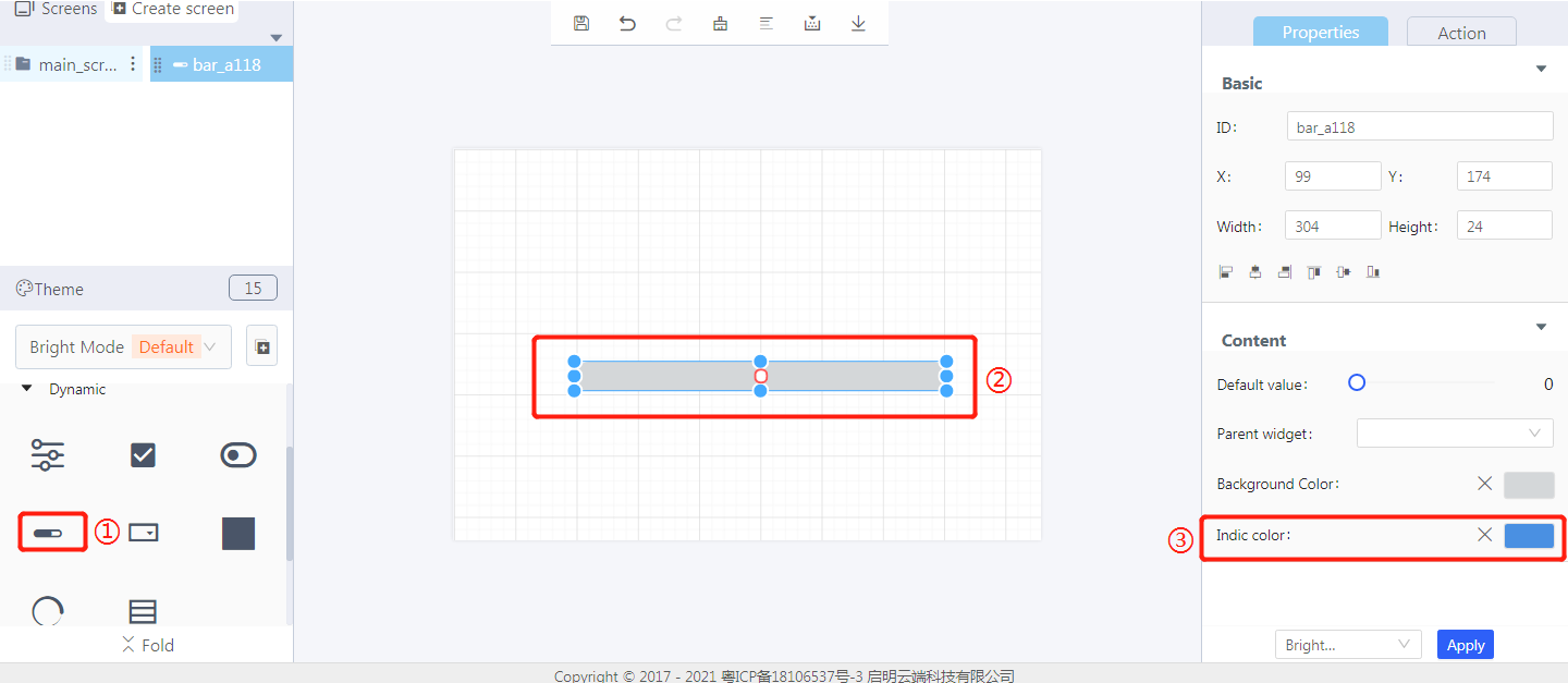
① Create a bar
② Drag and drop the border to adjust its size
③ Set the indicator color of a bar widget
2. Steps for use
2.1 Widget properties
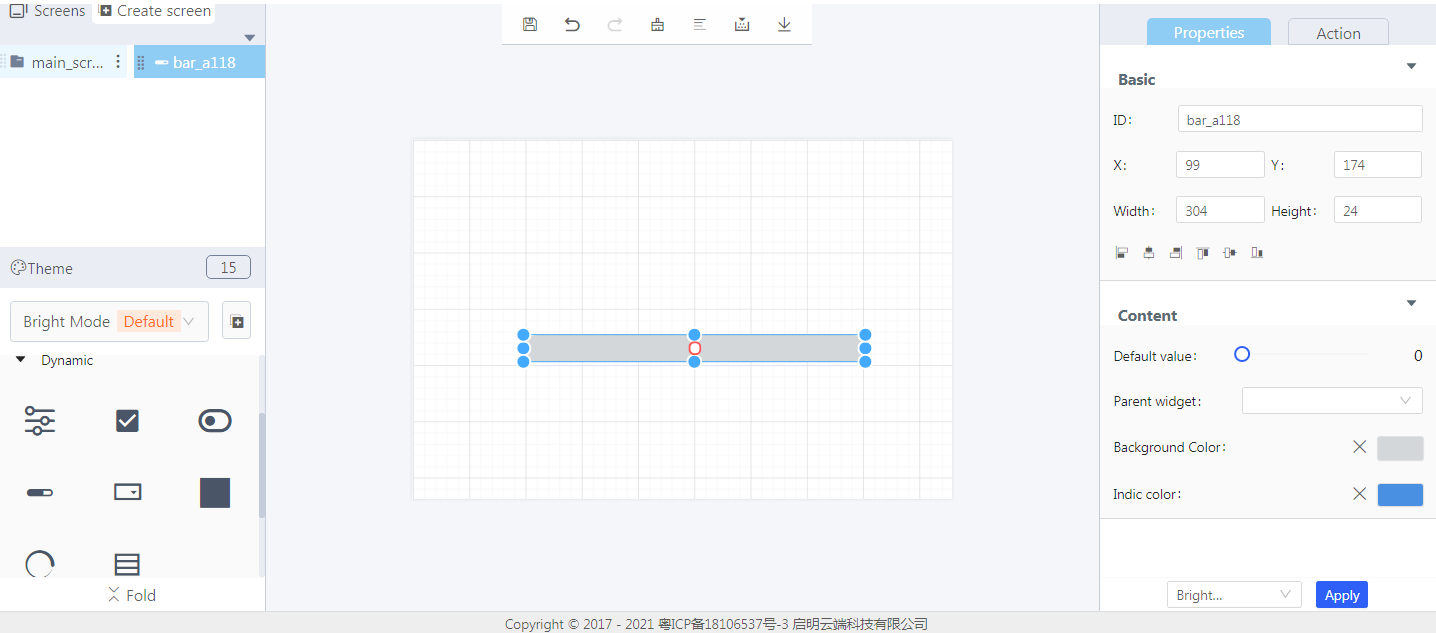
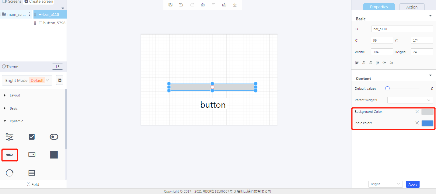
Properties-Basic:
ID: bar_a118 is the ID of the bar widget
X, Y: its coordinate position in the display area
Width, Height: the size of the bar widget in the display area
Alignment (in order): left alignment, horizontal center alignment, right alignment, top alignment, vertical center alignment, bottom alignment
Properties-Content:
Default value: set the initial value of the bar
Parent widget: set the parent object, and the bar widget is its child object
Background color: set the background color of a progress bar
Indic color: set the indicator color of a progress bar
3. Blockly—Bar
① Widget animation (it needs to be used with Process/Event)
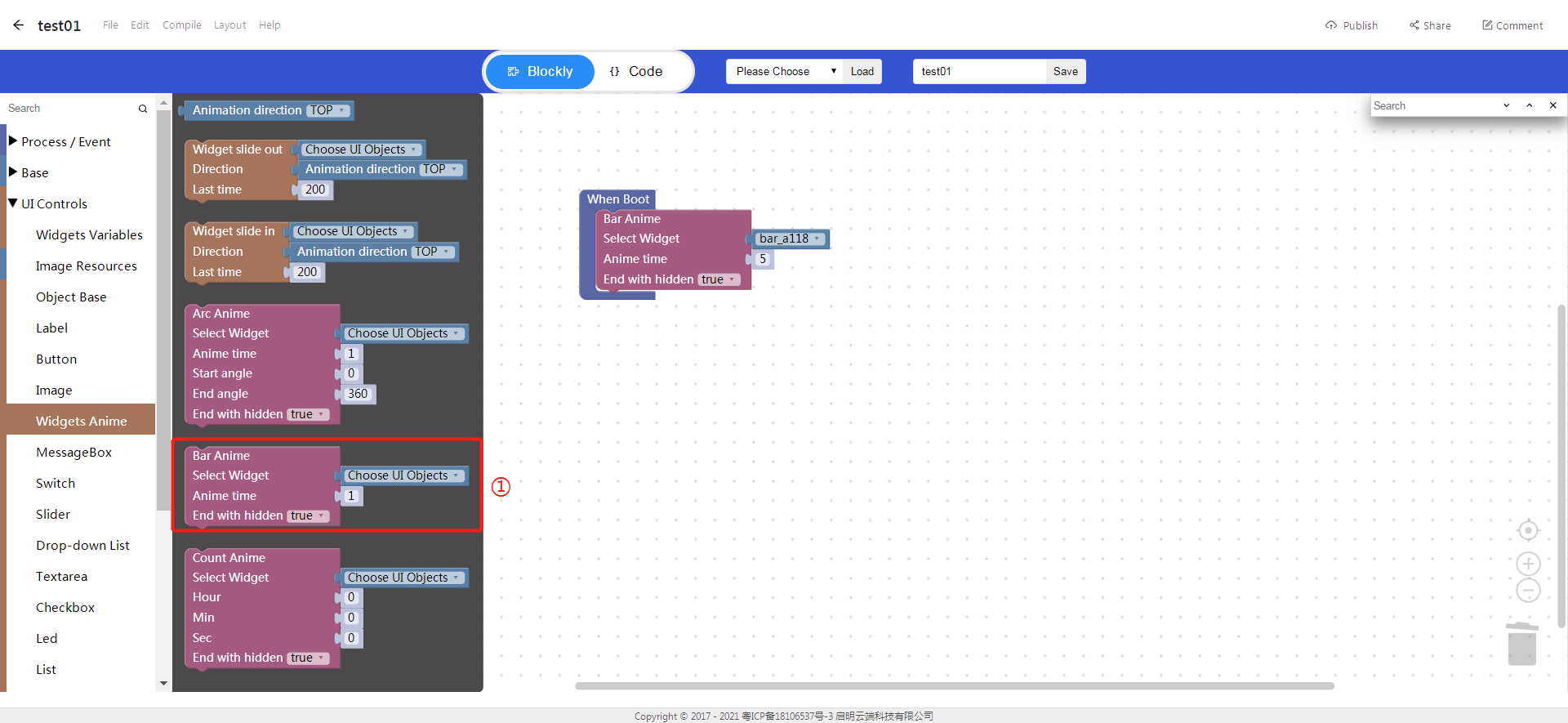
Choose UI objects: the bar widget ID created in Layout-Designer
Anime time: the duration of a bar animation, unit: second
End with hidden: true: hidden; False: not hidden
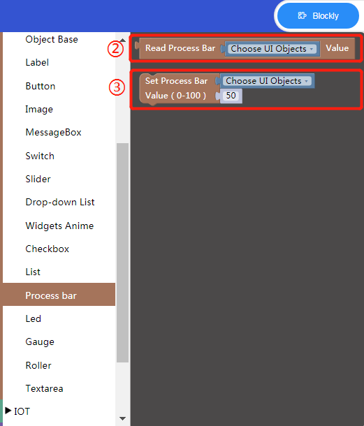
② Read progress bar value
Choose UI objects: the bar widget ID created in Layout-Designer
Read return value: return the current value of the progress bar
③ Set progress bar
Choose UI objects: the bar widget ID created in Layout-Designer
Value: set a new value to the progress bar
4. Implement an bar example with Blockly
- UI design
- Blockly design

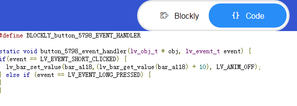
Description: When the button is clicked, the progress bar adds 10 to the original value.
- Click “{} code” to view the code:
5. Download and analyze the source code of the project
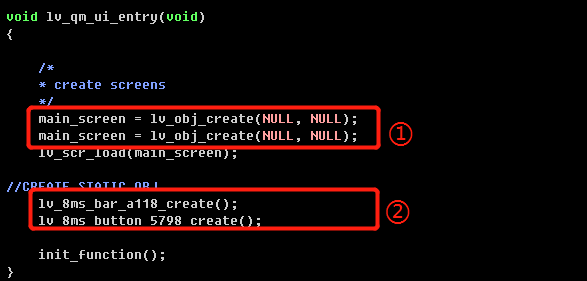
① Create objects
② Create widgets
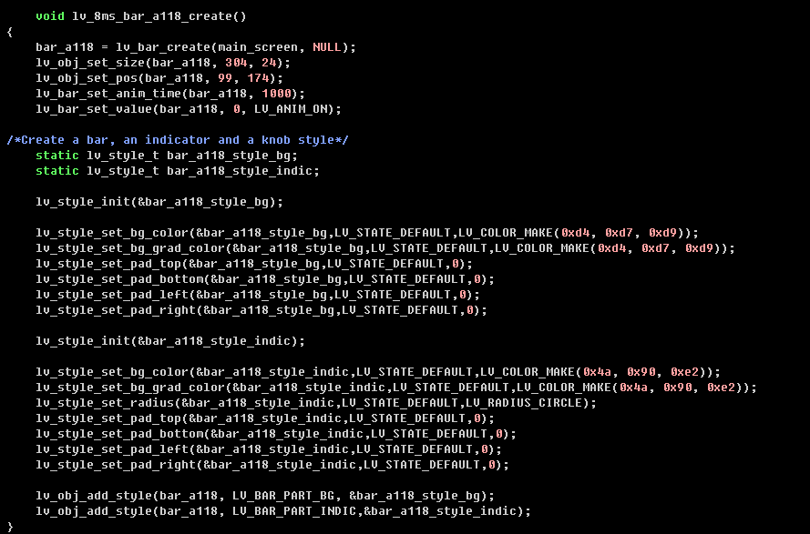
③ Set the style of the bar widget
④ Variable declaration

⑤ Blockly code

