Checkbox
1. Create a checkbox widget
Choose the checkbox widget in the Dynamic section of the sidebar.
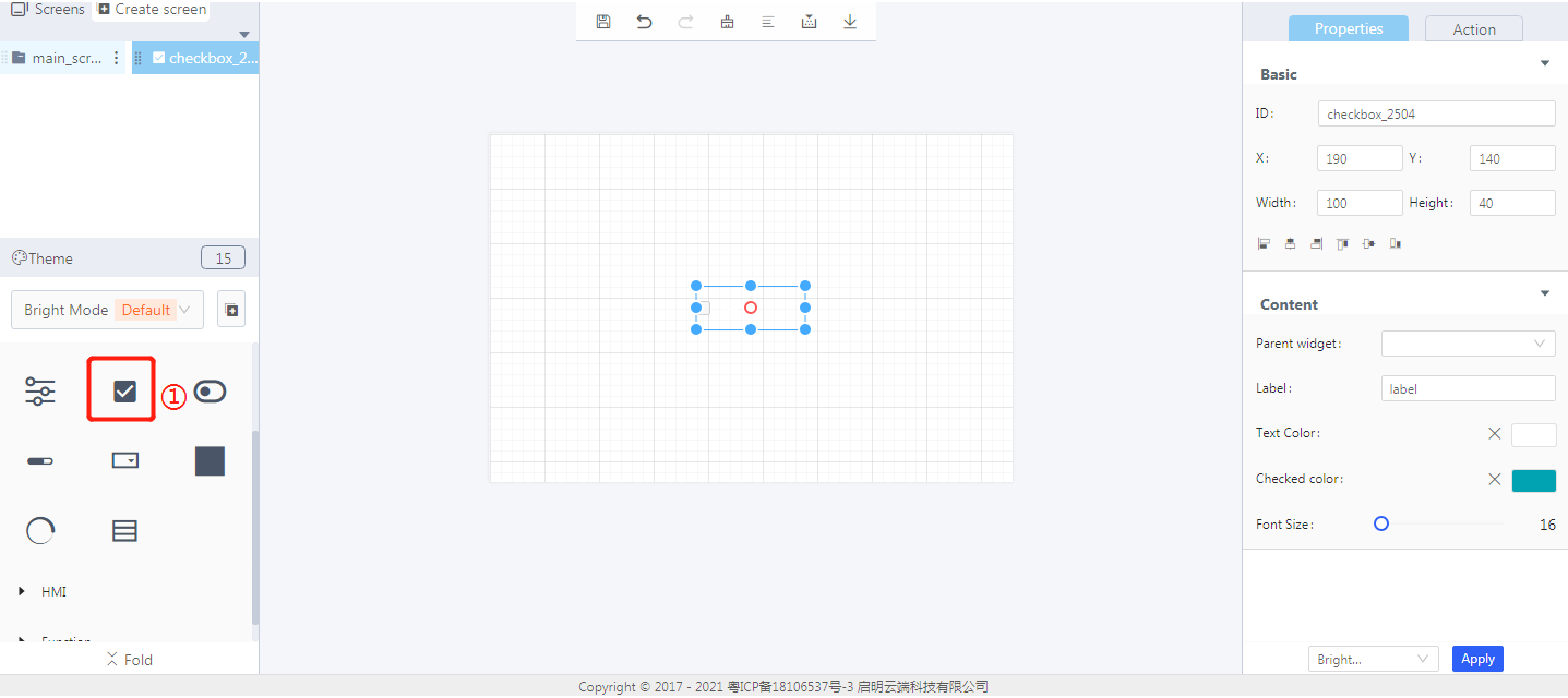
2. Steps for use
2.1 Widget properties
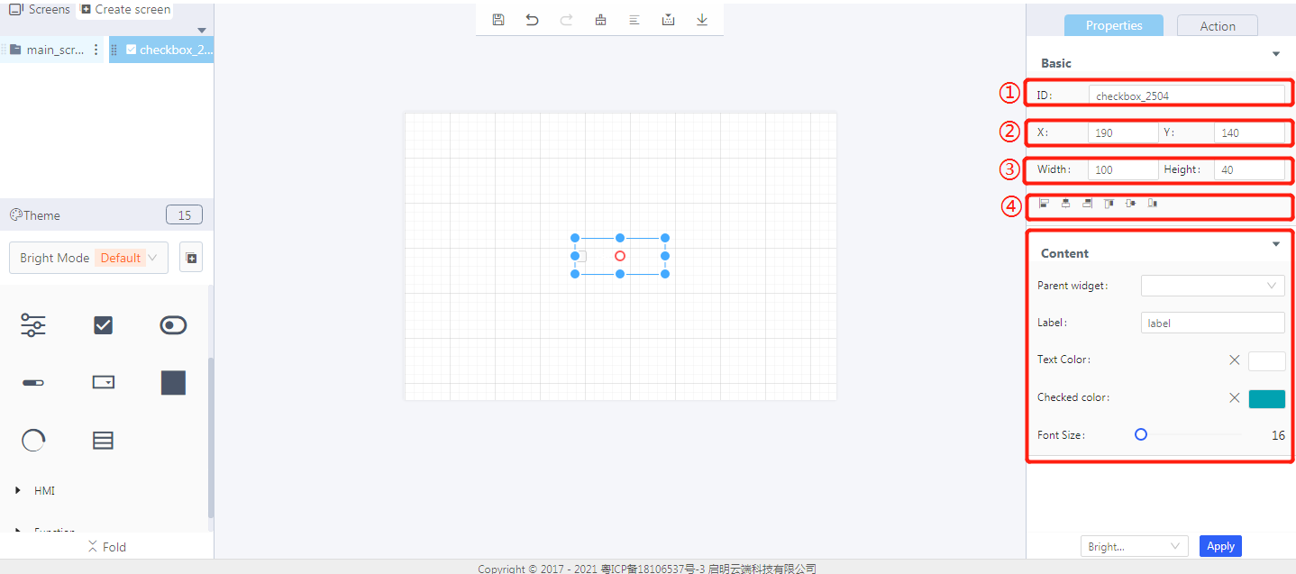
Properties-Basic:
ID: checkbox_2504 is the unique ID number of the checkbox widget
X, Y: its coordinate position in the display area
Width, Height: set the size of the checkbox widget
Alignment (in order): left alignment, horizontal center alignment, right alignment, top alignment, vertical center alignment, bottom alignment
Properties-Content:
Parent widget: set the parent object, and the checkbox widget is its child object
Label: the text content of the checkbox
Text color: the text color of the checkbox
Checked color: the color of the checkbox when checked
Font size: the font size of the checkbox text
3. Blockly—Checkbox
3.1 Blockly description
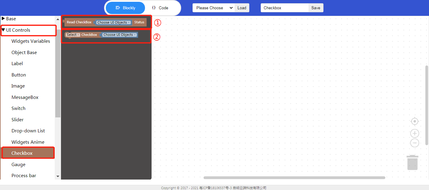
① Read checkbox status
Choose UI objects: the checkbox widget ID created in Layout-Designer
Read checkbox status: return value true: checked; return value false: unchecked

Click “{} code” to view the code:

② Set the checkbox status
Select/unselect: set the checkbox status
Choose UI objects: the checkbox widget ID created in Layout-Designer

4. Implement clicking the button to select/unselect the checkbox in Blockly(esp32)
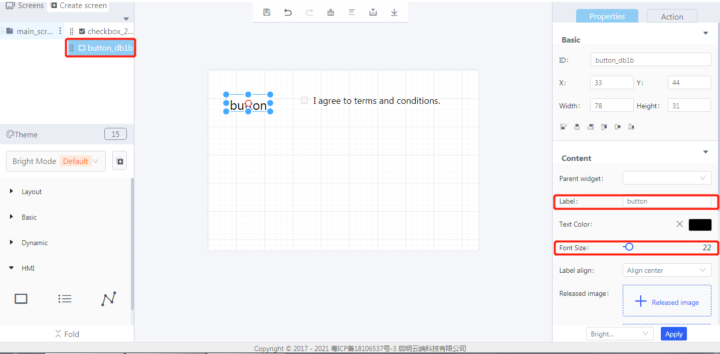
- UI design
Create a checkbox
① Drag and drop the border to manually adjust the size of the checkbox text area
② Set the text content of the checkbox
③ Set the font size of the checkbox
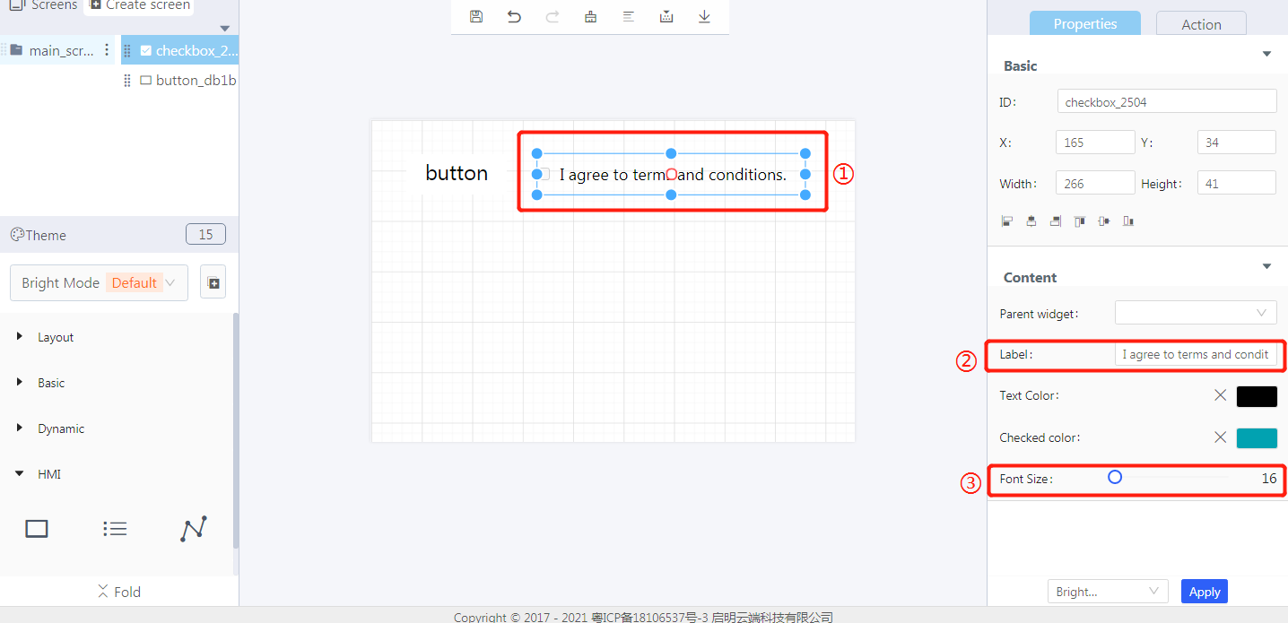
Create a button
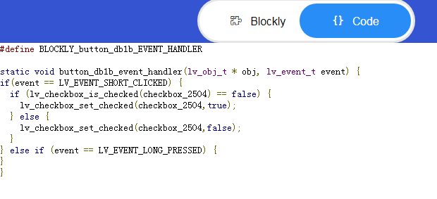
- Blockly design

Click “{} code” to view the code:
5. Download and analyze the source code of the project
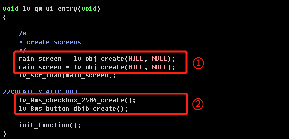
① Create objects
② Create widgets
③ Set the style of the checkbox

④ Variable declaration

⑤ Code generated from Blockly

