Button
Developers can customize its display style (supporting images)
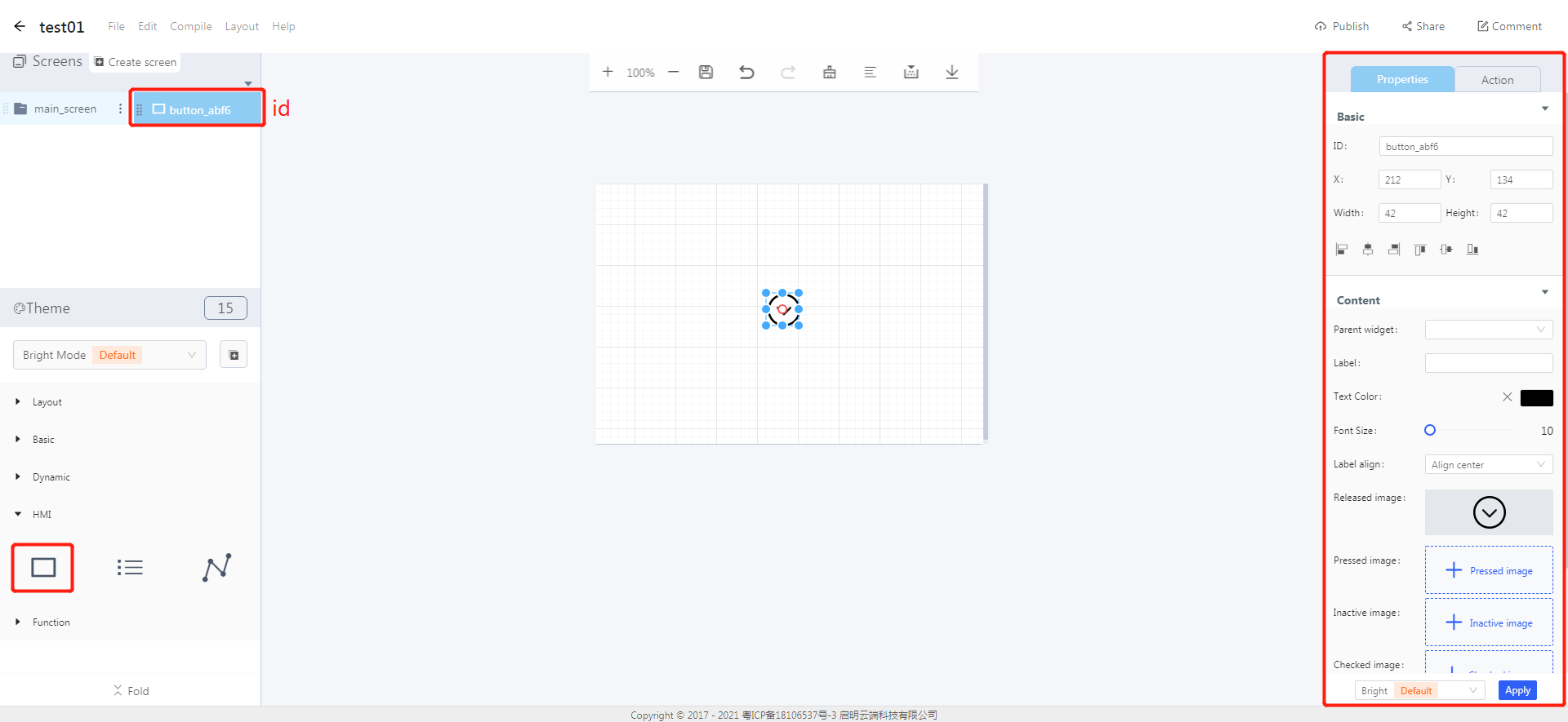
The button icon is shown in the figure.

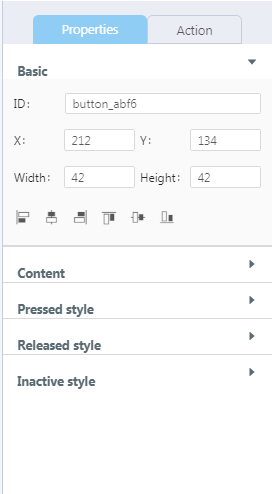
- You can set the state and style in the properties area of a button. When a button is pressed or released, its state and style will change. Correspondingly, it can trigger some event when a button state changes.
1. Create a button

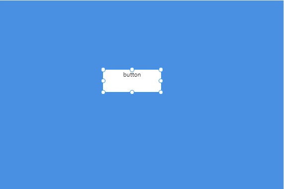
- Click the “button” in the widget box to create a button as shown in the figure.

2. Set the content for a button
Notes: The added image can not be named in Chinese, and its pixels can be no larger than the size of the current screen. If a button is set with an image, the text will be useless.
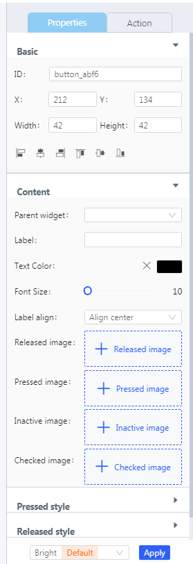
- Click the content drop-down in the widget properties area. You can set the content and style for a button, and add an image to the button.

3. Set the styles for a button
- Buttons have different styles in different states. You can click the style drop-down on the right to set a corresponding style for the button.

- Reference example:http://doc.8ms.xyz/docs/case-tutorial-en/case-tutorial-en-1cmbc7gfsdbpv
文档更新时间: 2021-08-09 17:23 作者:plj
